Exterior Elements: Modern Planters
While walking around the South Lake Union neighborhood of Seattle yesterday, we noted these thoughtfully designed corten steel planters. There remains a paucity of good options when looking for locally available planters for modern settings, and the most notable ones we see are site-built custom jobs. We particularly admired the way these were recessed into the spaces between the pillars and used the concrete wall as the back side of the planter. Have a favorite go-to planter? Share it with us--we are always looking for more options!

Favorite Gifts: Drawing a Tree
Every year or so, we find a perfect new gift, the thing we buy in multiples and keep on hand for hosts, loved ones or business associates. A few years ago it was Tivoli radios, then it was tiny hexagonal Japanese bud vases. This year's gift-on-hand is the beautiful little book Drawing a Tree by Bruno Munari. As the cover suggests, this book provides simple observations about the forms of trees and how they can be represented in a variety of media. For days after thumbing through it, one looks longer at trunks and branch forms, and even when sketching with the kids we find ourselves adding more variety to our arboreal efforts. Sweet, meditative and useful: what else could one want in a gift? We stock up on it at Peter Miller books in downtown Seattle.

Modern Down the Street: Soleil Development

The Best Modern Deck Railing (is the one you make)
Update! Update! For those few souls who might have followed our household plight in past months, I am happy to announce that we have a deck railing! Yes, a full two years after Ted laid a lovely new cumaru wood deck, we are able to dine al fresco. We went back and we went forth. We had plans to replicate the old railing, updated to baby-safe standards. We also considered all the other standard offerings for modern railings: cable, glass, etc. Hours were spent in CAD, fine tuning. Powder coat colors were considered, from harvest gold to black and--for a brief crazed moment--blue. But it never seemed quite right. Then I happened to pass a new house under construction down the street, and their elegant solution was clearly the best choice. We ended up more or less copying that design, which consists of welded steel panels that are side-bolted to the deck and reinforced with a wooden hand rail.
We had hesitated on having horizontal pickets due to the age of our young girls, but we figured they'd learn not to climb it, and the spacing is up to code so that they can't squeeze their noggins through. While the house down the street sports galvanized panels, we opted to powder coat ours black, to match our windows and house trim. While things like this never happen quite as quickly as one would like, we are quite pleased with the result. And the thrill of our "new" outdoor space inspired our babe to learn a new word: "Deck!"
Super Siding: Modern Exteriors
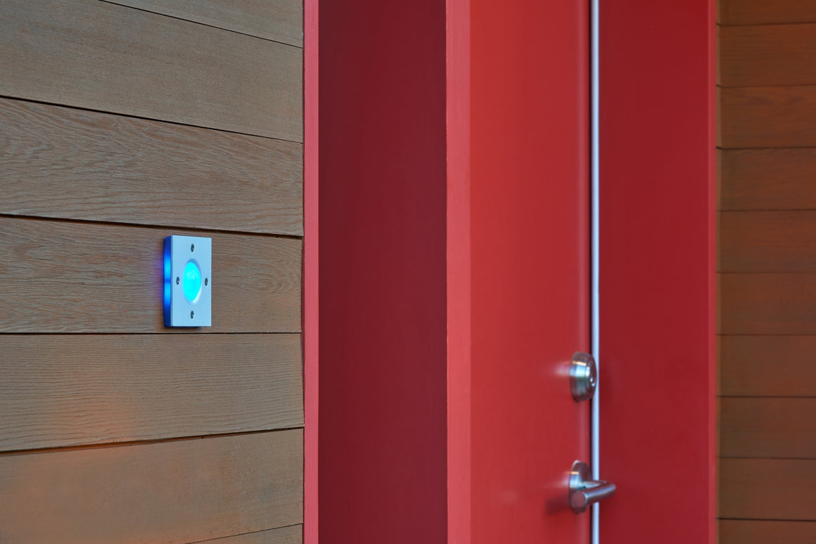
Being in the business of exteriors, you'd think we'd be down with all the latest and greatest in siding etc, but we tend to be navel gazers for the most part, and check only for doorbell buttons when we slowly cruise by any mod dwellings. Not that we don't notice, we just happen to be very focused on one very small thing. Micro destroys macro in our vision.
But when I was poking round all the fantastic submissions we got from Design Milk readers during our giveaway last month, I found this awesome duplex done by architect Nicole Blair of Studio 512 in Austin. For once, the siding made me look. It is nice to see color for a change, and the tone and dimensions play without being too much. I'd be curious to know how much upkeep it requires, but for now, I will just say: nice. We were also pleased to discover a nice shot of our Delight button on the Studio 512 website, and we are always happy to find that great architects already know us.


